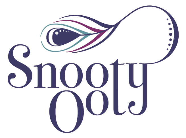
Snooty Ooty Logo design
Logo design for a new company creating hand made silver jewellery – their style is modern with clean lines and organic shapes. Their colours based on that of a peacock.

Snooty Ooty logo in stacked format

In-line colour and Black and White variants
Logo design brief
The image above is the final result of the brief. The brief was given by email and contained a summary of the influences on their jewellery designs with helpful images


The main focus for the logo design was to be a particular item of jewellery they had created, the peacock brooch (see image far left), which in turn had been based on styles derived from Indian block prints and paisley patterns (see image left).
From my point of view the peacock influence not only provided a great colour scheme, but also a strong visual aspect to the logo. The Indian block print style provided a brilliantly simple way of representing the peacock.
Project details
The lettering of the logo is an adapted version of the typeface Bodoni. Adding droplet style terminals to the S and y added to the block print feel of the logo design. Creating similar ends to the peacock feather as the serifs finish also helped tie everything together.
The logo can be used in it’s original stacked version or inline version depending of the space available to use. I hope in the future to be able to show samples of the logo’s usage.
Leave a comment
You must be logged in to post a comment.


