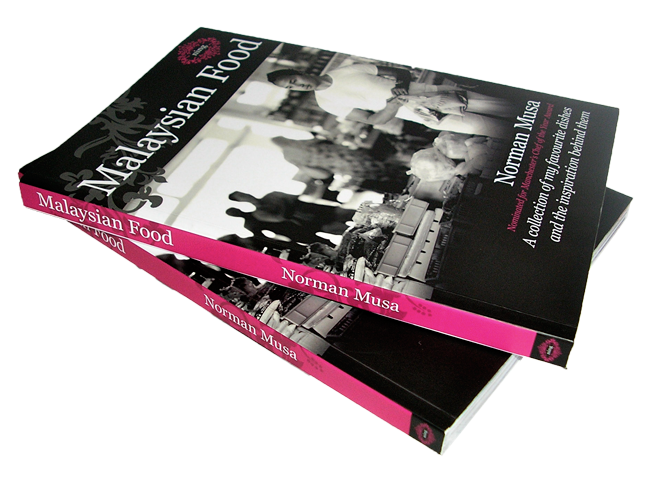
Self published book designed for a Manchester based restaurant. The style of the Ning restaurant brand needed to be worked into the book design, this happened mostly with colour and consistent use of type throughout the book.
Book design Brief
Authentic, personal, individual, ‘Ning’, stylish but not pretentious, simple. These were the words Ning wanted to used to describe their book. Malaysian food is not a typical recipe book, much of the page content is devoted to the story behind Malaysian food with personal introductions from chef Norman Musa, and intervals of information on specific everyday aspects of Malaysian food, as well as information about Ning and …
Read all of Ning’s Malaysian Food
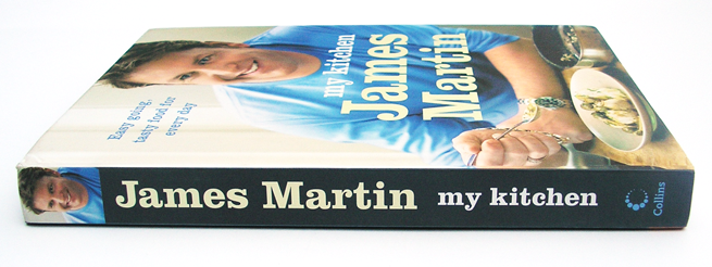
Internal book design and book setting for HarperCollinsPublishers. The concept design for this book was done by Allies Design, but lacked consistency. The design was finished and set by Typefunction.
Book design brief
The book was handed over partially designed, so my brief was to make the current design more consistant and work with the page extent needed for the book. Then to set the book within the schedule given.
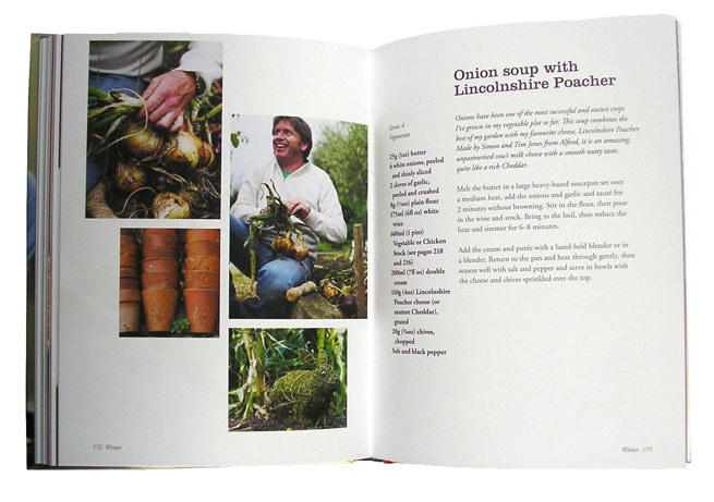
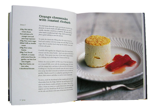
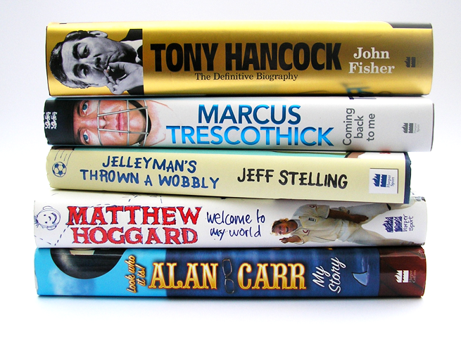
At HarperCollins Publishers, Colin Hall designed many biographies and autobiographies, most of which involve mono text pages and 4 colour plate sections.
Design Brief
All of these books have individual styles usually related to the person the book is based on, some can be fairly straight, others require some basic illustration to liven up the text page, most have colour plate sections, which increasingly needed to be stylised beyond a standard plate section.
Matthew Hoggards book even went as far as having a flip animation throughout of a cricket ball heading for the stumps throughout the book….
Read all of HarperCollins Biographies
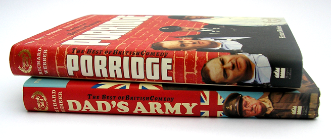
A series of books containing scripts and stills from the British TV comedy series. Internal design by Colin Hall whilst working for HarperCollins Publishers. Cover Design by HarperCollins Publishers.
Book design brief
Each book needed to reflect the Tv series it was based on and accommodate stills from each series. Pages of quotes recounting memories also needed to fit in around the episode scripts.
From book to book you will see a consistent text type, use of colour and style of boxed text. What changes is the type used for headings (which is the type used with the TV series), the colour used and background images for boxed text….
Read all of Best of British Comedy Series
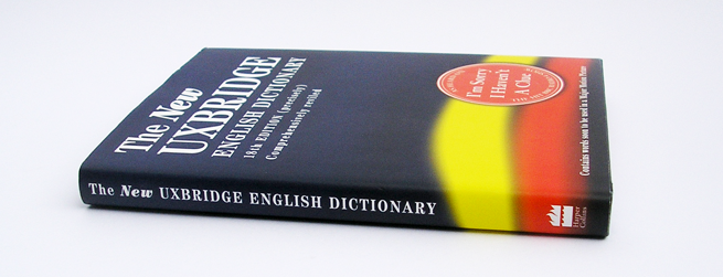
A humour book based on the BBC Radio 4 show ‘Sorry I haven’t a clue’, designed by Colin Hall whilst working at HarperCollins Publishers. Cover Designed by HarperCollins cover design team.
Book design brief
This book is an updated edition, so the design had to be roughly based on the previous edition. The larger illustrations were drawn by ?????, the smaller illustrations had to be sourced for free from Dover books of stock illustration and where necessary adapted by Colin Hall to convey the ‘correct’ meaning.
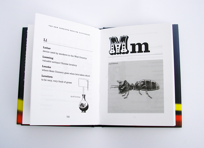 …
…
Read all of The Uxbridge English Dictionary
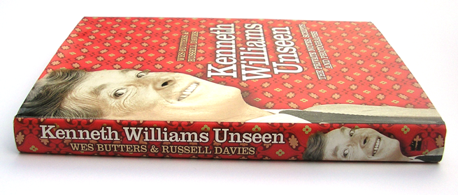
A biography about Kenneth Williams, designed by Colin Hall whilst working at HarperCollins Publishers. Cover Designed by HarperCollins cover design team.

Book design brief
This book focuses on the unseen photography and scripts of Kenneth Williams. The text is mostly quotes from Kenneth’s friends and colleges concerning their memories of him.
The page design had to be adaptable enough to accomodate all different shapes and sizes of image and have some fairly lengthy captions along side the main text. I chose to use the typeface perpetua for the body text in combination with Clarendon for headings and captions, providing a very English style to match Kenneths Character.
The book also makes …
Read all of Kenneth Williams Unseen


 …
…