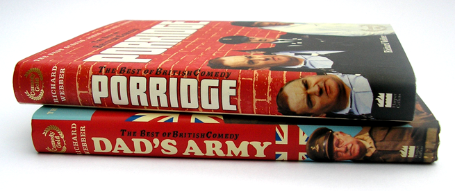
A series of books containing scripts and stills from the British TV comedy series. Internal design by Colin Hall whilst working for HarperCollins Publishers. Cover Design by HarperCollins Publishers.
Book design brief
Each book needed to reflect the Tv series it was based on and accommodate stills from each series. Pages of quotes recounting memories also needed to fit in around the episode scripts.
From book to book you will see a consistent text type, use of colour and style of boxed text. What changes is the type used for headings (which is the type used with the TV series), the colour used and background images for boxed text….
Read all of Best of British Comedy Series
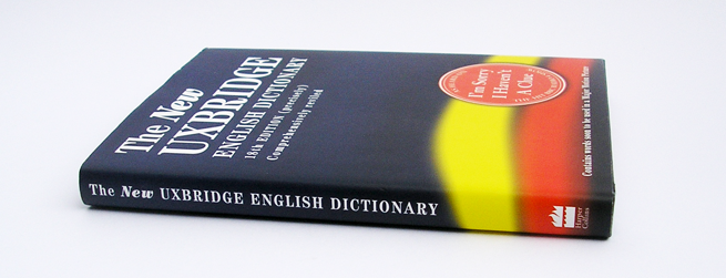
A humour book based on the BBC Radio 4 show ‘Sorry I haven’t a clue’, designed by Colin Hall whilst working at HarperCollins Publishers. Cover Designed by HarperCollins cover design team.
Book design brief
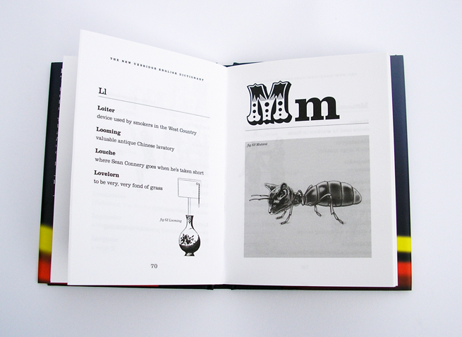
This book is an updated edition, so the design had to be roughly based on the previous edition. The larger illustrations were drawn by ?????, the smaller illustrations had to be sourced for free from Dover books of stock illustration and where necessary adapted by Colin Hall to convey the ‘correct’ meaning.
 …
…
Read all of The Uxbridge English Dictionary
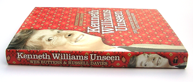
A biography about Kenneth Williams, designed by Colin Hall whilst working at HarperCollins Publishers. Cover Designed by HarperCollins cover design team.

Book design brief
This book focuses on the unseen photography and scripts of Kenneth Williams. The text is mostly quotes from Kenneth’s friends and colleges concerning their memories of him.
The page design had to be adaptable enough to accomodate all different shapes and sizes of image and have some fairly lengthy captions along side the main text. I chose to use the typeface perpetua for the body text in combination with Clarendon for headings and captions, providing a very English style to match Kenneths Character.
The book also makes …
Read all of Kenneth Williams Unseen
Branding design including logo and colours to be for the design of, business cards, letterheads and a website. Fresh Perspectives want to present their new company with a consistant look which conveys authority with out being boring.

Branding design brief
The brief eventually developed from designing a document to introduce clients to Fresh Perspectives, to a complete branding design package starting with the logo and moving into business cards and letterheads and finally a company website.
The design of the branding package was to focus on what Fresh Perspectives brings to their clients – A fresh and complete view of how their company is performing….
Read all of Fresh Perspectives Branding Design
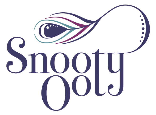
Logo design for a new company creating hand made silver jewellery – their style is modern with clean lines and organic shapes. Their colours based on that of a peacock.


Logo design brief
The image above is the final result of the brief. The brief was given by email and contained a summary of the influences on their jewellery designs with helpful images


The main focus for the logo design …
Read all of Snooty Ooty Logo design


 …
…